Why I’m Putting Readability Statistics in All My Posts

language, communication, messaging, nonprofitsRecently, I started putting Readability Statistics in my posts (like in this one). Let me explain why.

I’ve been singing the gospel of Readability Statistics for quite some time. I encourage all of my clients and students to do a readability test on everything they write.

That’s because there is no easier and cheaper way to increase a reader’s ability to understand what you’re saying than by writing at an eighth grade level or below. (This post explains why.)

When I work with a nonprofit, I always start by running their Vision and Mission Statements through a reading ease test and The Wordifier. I also do this before a meeting with a potential client, too. Gives me a sense for where they’re at.

I have found that most nonprofits write at a much higher level. Often a level that would require one to have a PhD. Since only 1.68% of Americans over the age of 25 have a PhD, that means a lot of potential donors, volunteers, staff and board members have no clue what you’re saying. #Bummer

I’m hoping that, over time, nonprofits in general, and readers of this blog in particular, will get in the habit of checking the readability of their writing. It’s cheap, easy and effective.

I figure if you see Reading Stats for each post, it’ll up the odds that you might give it a go.

My theory is: the more you see it, the more it’ll be on your radar. And, eventually (hopefully!), you won’t be able to resist finding out whether your writing is attracting as many donors, supporters and volunteers as possible to your work. Cuz who doesn’t want that?!

Post Readability Stats: Reading Ease 66.3, Grade Level 7.8

***Claxon University–where smart nonprofits learn how to use better words to create a better world.***

Are you venustating the world?

standing out, nonprofits, languageVenustate: to make beautiful; improve
Like you, I spend a lot of time thinking, and talking/writing, about improving things. Everything from blog posts, web copy, newsletters and Mission Statements to nonprofits, communities and the world.

Who wants to improve when you could venustate? Venustating a blog post or–thinking big picture–the world sounds so much more fun and important, doesn’t it?! (Clearly, venustate wouldn’t be appropriate in all contexts, but a super fun swap-out for word-savvy readers like you.)

We often perendinate expanding our vocabularies.  Who has time to learn new words when we’re awash in so many already?!

Between texts, emails, Facebook, and good ol’ fashion convos, words come at you at a breathtaking pace.

And therein lies the opportunity.

If you want more people to support your nonprofit, this onslaught of words is precisely why learning new words presents such a big opportunity–it’s one of the easiest, cheapest ways to get, and keep, attention!

And getting attention is the first step to getting people on your nonprofit’s Engagement Cycle.

You may recall that when we did the research for The Wordifier, we learned that nonprofits were using a scant 5% of the words in the English language. Let me say that differently: five percent.

Let’s flip that sad fact on its head: 95% of the words in the English language are out there waiting for nonprofits to use them to get, and keep, people’s attention. This is why Lesson 4 of Claxon University’s Words on a Mission course focuses on creating an Organizational Lexicon. It builds in an opportunity to take advantage of the 95% of hardly used words.

[Important, related side bar: Interesting, brand-defining words are particularly important for your Mission Statement.]

To be clear: stringing together a bunch of hardly used words isn’t the answer to your engagement woes. Rather, plucking out a choice verb, adjective, and/or noun from your ever-expanding vocabulary and pairing it with more common words lands you in the sought-after messaging sweet spot.

One of the easiest ways to become a vocab rock star is to subscribe to Dictionary.com’s Word of the Day feature. I never cease to be amazed at how many of the words I don’t know…and find super handy as soon as I do!

Or, if like quirkier words, check out Unused Words. Their commitment to keeping the vivacity of the English language alive is unparalleled. #Gratitude

***Take a few minutes to see if Claxon University is for you! At $2.60/day, it might be one of the best investments you can make in your organization this year.***

Post Readability Stats: Reading Ease 62.6, Grade Level: 8.2

The messenger matters: why nonprofits should have authority figures on their side

Earlier this week, I wrote this post about a great TV ad Prudential did.

Einstein: a go-to authority figure

Did you notice who the pitch man was for the ads? You might’ve seen his name flit across the bottom of your screen. That’s Harvard Professor Dan Gilbert. He wrote Stumbling on Happiness and has done some great TED Talks.

Gilbert is The Man (aka a leading authority) on the science of decision-making and happiness and other cool, brainy stuff. Stuff like persuasion.

In Claxon University’s course Words on a Mission, students watch this video about the Science of Persuasion. There are six principles that the authors have found to be truly effective when it comes to persuading people to do things…things, like, oh let’s say donating to your nonprofit.

One of those principles is about authority. We like to hear from authority figures. It makes us feel better about our decisions. The authority is smart, therefore we will be smart if we do what they are suggesting.

The Prudential ads didn’t really play up Gilbert’s as an authority figure. And missed an opportunity to further persuade people to invest in their retirement.

Is your nonprofit missing out on a similar opportunity? Is there an authority figure in your field who could speak out on your behalf and/or validate your approach? Note that this persona might be a professor or a researcher, but someone who has walked in the shoes of the people you serve is also an authority figure.

[Bonus: Since we’re talking about videos, take a minute and watch this gem by the Rainforest Alliance. #NailedIt]


Fundraising inspiration via Prudential TV ads

Prudential TV ads, retirement, nonprofit, fundraising

You never can tell where inspiration will come from, can you? I mean, who would’ve thought that some Prudential TV ads would offer up inspiration for nonprofits and fundraising. But they did!

Indeed, Prudential did a series of T.V. ads using data visualization and behavioral economics to encourage specific actions like saving for retirement or thinking about the future or paying yourself to do what you love. You’ll note a general theme of thinking differently about retirement but each ad has its own slant on that.

This is the ad to which I want to draw your attention. It shows how tiny investments in your retirement account can add up to big retirement savings.

What do TV ads by a big financial institution and dominoes have to do with your nonprofit and fundraising? Possibly a lot.

Nonprofits dream of many things, among them an individual giving program that has a stream of recurring monthly donations flowing in. You frequently see messaging about how every little bit counts and it adds up. Makes perfect sense. It’s good for the organization and makes it easier on the donor because the payments are spaced out.

And yet nonprofits still struggle to develop an individual giving program with lots of monthly donations. What’s the disconnect? 

Maybe it’s the delivery. Meaning, maybe nonprofits aren’t making it easy enough for their dear donors to see and feel and instantly get why those little monthly donations mean oh so very much. It’s one thing to explain the logic. Quite another to drive the point home.

Enter the Prudential ad. By using dominoes, they make the “a little bit can ad up to a whole heckuva lot” point so clearly.

Now, before you start shaking your head and mumbling things like, “But, Erica, we don’t have the money to spend on an ad like this.” No, you likely don’t. But you do have access to tools like Canva and LiveStories, which make it easy peasy to take data and turn it into something inspiring and actionable.

And you likely have a smart phone. Video doesn’t need to be highly produced. It needs good audio and to be authentic.

Be inspired and go out and inspire others. #ALittleIsALot

***Inspired to learn more about how you can tell great stories about your organization? Check out Claxon University!***

Are you writing gobbledygook?

man talking on the phone but does not listen

I’m a gihugic fan of figuring out if what you’re writing can be easily understood by your readers. Those readers may be donors or board members or volunteers or any number of people who care–already or potentially–in your cause.

So it’s important that they understand what you’re saying. Seems obvious enough, right?

And yet, sadly (very, very sadly) a lot of nonprofits are putting out gobbledygook rather than easy-to-understand writing.

Most organizations don’t know they’re generating gobbledygook. Makes sense to them, so it must make sense to other people, or so goes the thinking.

I’m here to tell you that just because it makes sense to you, that doesn’t mean it makes sense to anyone else, especially people who are just getting to know your organization. Nope. Sure doesn’t.

Luckily, linguists and researchers and other super smart people have developed readability tests. You put in your words. They tell you how easy it is to understand them.

I’ve extolled the virtues of the Flesch Reading Ease Score for many moons, as did our super fab intern, Tessa, in this post on tools to help you write. But that’s just one reading test. There are others.

For instance, try out this one from Readability Formulas. It puts your text through seven reading tests and then gives you a verdict on the overall reading ease.

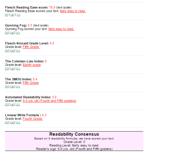
I put my most recent blog post on the Engagement Cycle in there and learned it was “fairly easy to read”.

Here’s, specifically, what I learned:

Reading Ease Screen Shot

Your goal is for a grade level that’s under Grade 8. That’s not because you think your supporters stopped going to school after Grade 8. It’s because that’s the level at which–regardless of how many degrees you’ve earned–it’s easiest to understand what someone is trying to communicate.

I write day in and day out. And I still check the reading ease of pretty much everything I write. Why? Because I want you to be able to easily understand whatever I’m talking about, so you can start doing it!

Reading ease is where it’s at. Try it out for yourself!

The Engagement Cycle: Know, Understand and then (and only then!) Engage

engagement, connection, marketing, fundraising, strategy
Engagement Cycle

In writing my book, Pitchfalls: why bad pitches happen to good people, I encourage people to let go of the idea of having one elevator pitch (creepy!) and instead map their pitches to an Engagement Cycle (see image to the left).

It seems forehead-slappingly obvious when you stop to think about it. Of course a donor would need to know you and understand you before she would engage with you.

But it’s stunning how frequently nonprofits leap straight from know to engage. And that leaping isn’t good for your mission.

This leaping comes from a good place. We love what we do so  much, that we sometimes (often?) have a “to know me is to love me” mentality.

“But of course someone will want to support our organization! How could they not?! We save animals. Who wouldn’t want to save animals?!” 

A lot of people, it turns out. Because not everything cares about animals…or feeding the hungry, or the arts, or education, or whatever your cause is.

Even if, by chance, you got someone moved from knowing you to supporting you in short order, if you didn’t take the time for them to really understand you, the chances they’ll renew their support go down. Dramatically, precipitously down.

You want your renewal rate going up, not down, right? You want more people more deeply engaged in your mission, right? If so, let’s take a look at each step of the Engagement Cycle so you can start using it to achieve those goals.

1.  KNOW: The ‘know’ pitch answers the question: ‘What do you do?’ You want a pitch that is remarkable—meaning interesting enough for people to remark on it to you and (pay attention because this next part is very important in terms of word-of-mouth marketing) to others.

2.  UNDERSTAND: Once you’re on someone’s radar, i.e. they know you exist, you need to make sure they really, truly understand what you do and why you do it. Of all the organizations out there, why should they engage with yours? What makes you special? Compelling? Unlike any other? Your ‘understand’ pitch answers these questions. It answers the question: ‘Why you?’

3.  ENGAGE: Donate. Advocate. Volunteer. Buy. This pitch answers the question: ‘How can I engage?’ This is the pitch that moves people from learning to doing.

Is it simple? Yes. Is it easy? Not always. Is it worth it? Yes.

***If you want to master this process, check out Claxon University’s Words on a Mission course. In this self-paced course, your organization can create a collection pitches that will effectively and efficiently move donors through the Engagement Cycle!***

Is surprising supporters good or bad?

nonprofits, messaging, language, words, messaging
Yawning’s cute when it’s a baby doing it. Not when it’s a supporter.

There’s a really interesting blog post called, “How to Improve Your Writing: 5 Tips from Hollywood” by Eric, “the guy behind the Barking Up the Wrong Tree blog“.

Tip #2 was: Surprise your readers.

Why surprise? Because we remember things that surprise us.

This got me wondering: Do nonprofits surprise their supporters enough? 

If we’re looking at the words nonprofits use, the answer would be absolutely, positively not! Our research shows that nonprofits are doing a downright miserable job of surprising their supporters and a very good job of boring them.

Nonprofits are only using 5% of the words in the English language. And 1% of the words nonprofits use account for 65% of all the words they use.

No surprise–it’s a linguistic yawnfest.

It begs the question: how do you effectively surprise supporters?

Back to Eric and the blog post:

Surprise comes from knowing the expectations of your audience — and then turning them on their head.

In order to do this effectively, you first have to know your supporters inside and out. That means creating personas. (If personas are new to you, read this, this and this.)

Once you know the types of words that will resonate with a given persona, brainstorm words that are similar but have a bit more oomph.

There’s a fine line between startling and surprising. Surprising is good. It wakes up the brain. It’s engaging. Startling can be off-putting. So don’t go overboard.

Some ideas for generating words that surprise:

Bored supporters are rarely happy supporters. Happy supporters are usually stupendous supporters. So, for their sake and yours, mix up your language. Surprise them. (Whatever you do, don’t ever send them a boring thank you letter.)

Is your writing about expression or impression?

Old vintage typewriter, close-up.

Recently, I asked if your writing made people dream or think? I advocated for a combo meal–sometimes writing to make people think and sometimes to make them dream. Depending, of course, on audience and context, and where someone was vis-a-vis the Engagement Cycle.

Now I want to ask you this: is your writing simply an expression or does it, in fact, make an impression?

Umair Haque–economist, author and super smart dude–thinks it’s only about expression.

Umair Haque, writing

[If you don’t know Umair, he’s da bomb. He’s thought-provoking and insightful and has a way of making you re-think your world that is both frightening and liberating.]

For certain types of writing, Umair may be spot on. But when it comes to nonprofits and writing, the goal should be to express so that you impress. Anything less is time wasted.

There’s an opportunity to cost to writing, i.e. if you’re writing, you’re not doing something else. Nonprofits are trying to do so much with so little that opportunity costs are even more pronounced.

  • If you’re the Executive Director of a small nonprofit and you’re writing a grant, you’re not spending time with donors or meeting with program staff to fine-tune your after-school program.

All of the above-mentioned activities are critical. So if you’re spending time writing–whether it’s a grant, or web copy, or a blog post, or notes from a recent donor meeting, or whatever–that writing should get you somewhere. It should be good enough to impress the people–donors, volunteers, elected officials, advocates, board members, staff–who matter most to your organization at a given point in time.

As with all other activities your nonprofit takes on, writing should be about impact. It should be about moving people along the Engagement Cycle. It should elevate and advance your mission and your work. Anything less is simply expression without impression. 

Some resources to help you write impressively:

  1. The Wordifier helps you amplify your words.
  2. This post gives you tips for error-free writing.
  3. And Claxon University’s Words on a Mission course will guide you to words that will definitely impress.


140 Characters of Pure Persona Bliss

In my last post, I fleetingly mentioned 140 character personas. These deserve more air time. They’re super cool. They have the power to transform your nonprofit’s messaging.

Meet Jia Zhang. He is a graduate student at MIT’s Social Computing Group and a visual journalist intern at FiveThirtyEight. Zhang noticed the following:

Census data is often seen at a large scale — atlases, research studies and interactive visualizations all offer the view from 10,000 feet. But there are people inside those top-line numbers. And when you start to look at the people in the data sets, you get a glimpse of their lives. Just a few descriptors — how much they work, whom they take care of, where they were born — can give us a sense of the people around us.

http://fivethirtyeight.com/datalab/introducing-censusamericans-a-twitter-bot-for-america/

http://fivethirtyeight.com/datalab/introducing-censusamericans-a-twitter-bot-for-america/

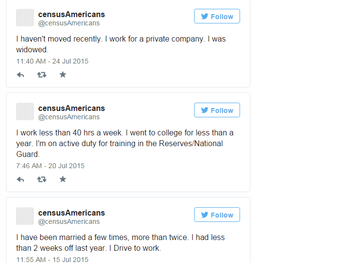
Called censusAmericans, it tweets short biographies of Americans based on data they provided to the U.S. Census Bureau between 2009 and 2013. Using a small Python program, the bot reconstitutes numbers and codes from the data into mini-narratives. Once an hour, it turns a row of data into a real person.

This clever Twitter bot mines census data and dishes up gems like these:

Personas, Twitter, census data


And–bam!–just like that you get a good sense for these people. Can’t you just see how their story might unfold? Can you see how what these three people care about might differ? How their day-to-day lives would look really different from person to person? Knowing that–and expanding on it to create a full persona–is the stuff of messaging magic.

If you don’t have the time, or feel overwhelmed at the prospect of, creating a full-blown persona, create a 140 character one. It’s a whole heckuva lot better than not having a persona at all! Zhang has made it easy–simply look through the censusAmericans Twitter stream for inspiration that auto-magically regenerates every hour!

The REALLY Terrible Orchestra of Westchester has REALLY Terrific Messaging

Not a member of the Really Terrible Orchestra of Westchester...but he could be if he wanted to be!
Not a member of the Really Terrible Orchestra of Westchester…but he could be if he wanted to be!

Last week, I was on a bit of a doom and gloom streak regarding nonprofits and their websites…or lack thereof. (See posts here and here.)

So I thought a little ray of sunshine might be in order. And that little ray comes in the form of The Really Terrible Orchestra of Westchester.

We came across this little gem of an organization while gathering nonprofit websites for the Wordifier research.

So much goodness going on word-wise for this organization. Where to begin?!

Their tagline? Wait for it…

All you need is an instrument and a pulse!

Could it be any more fabulous? Could it ooze more personality? Could it bring a bigger smile to your face? No, no and no.

And their Mission Statement? Just as fab.

Our mission is to share a love of music and the desire to improve our playing while having FUN!

Unlike most nonprofit Mission Statements, which are technically incomprehensible, this one has a Reading Ease Score of 76.2 and the Grade Level clocks in a pitch perfect 7.3. Translation: When you read it, you get it. And that’s all good.

Do I wish the visuals on their website were as spunkarific as their words? Of course! But you know what? Their words are oh-so-good, I can totally let it go.

If you want to be an organization that wields words as well as the fine folks at the Really Terrible Orchestra of Westchester, check out Claxon University’s course, Words on a Mission. We’ll get you sorted out straight away!

Do you communicate as effectively as you think?

X

Do you communicate as effectively as you think?

X