Blog

Name That Event!

Event season is upon us, and many non-profits are planning events from breakfasts to art auctions in order to get noticed—and get funded.

It’s always fun to learn from the best. That’s why we turned to Shanon Doolittle (@sldoolittle) for some insight and inspiration.

Emerald City and Disco Inferno

Shanon is in charge of Group Health Foundation’s Gift of Health Gala, one of the Northwest’s most successful fundraising events. The name of the event is always the Gift of Health Gala, but she changes up the theme each year.

In 2010, it was ‘Journey to the Emerald City’.

In 2011, it was ’10! A Disco Inferno’.

In 2012, you’ll have to wait for it. But it’ll be just as awesome. Fresh and fun…yet still the Gift of Health Gala.

Shanon’s wisdom:

“Approach your event as its own brand. You can’t build equity or supporter loyalty if you confuse supporters each year with a name change or a completely different event experience. The name of the game is making it easy for your donors to identify your event and cause. A consistent name does that. And if you really want to get strategic-licious, hold the event on the same day every year (second Saturday of October for example). Donors will then know to save the date way before you send it.”

Our Recommendations:

  1. Keep the same name and logo each year so funders and donors can remember your event, and hopefully your organization as well. Never forget: your event reflects who you are as an organization.
  2. When you’re planning your fundraiser, decide what actions you want your donors and funders to take. Donate money? Volunteer? What’s the ripple effect you want from the event, ultimately? Make the event match your goals. (Sounds like a ‘no duh’ but staggering how often this doesn’t happen.)
  3. Keep it simple. Attendees want to relax and enjoy themselves at your event, not try to figure out what it is exactly your organization does. That should be apparent from the brand of the event. Definitely change the theme to make it fun, but keep in mind the event should be as consistent as you are.

What suggestions do you have for successful events?


Are you serving up guilt or potential?

As a reader of this blog, you realize the importance (and value) of a well-crafted message. But do you realize the importance of the HOW you package up your message?

There are many angles at our disposal. Our visuals and content can be funny, quirky, upbeat or solemn. It can also be inspirational and even manipulative.

Yup, manipulative. Seen those commercials by the Society for the Prevention of Cruelty to Animals, aka, the ASPCA in the States? The ones with the abused animals looking at you like you’re the only who can save them? The ones that make you sob and reach for the tissues? That’s using guilt to make you reach for your wallet after you’re done with the tissues.

Based on the fact that some organizations continue to spread on the guilt, the guilt perspective must work for them.

Another messaging perspective focuses on potential, using imagery of hope and positive outcomes instead of gut-wrenching pictures and tear-jerking music to inspire audiences to donate. A local Washington animal shelter, PAWS, uses words and visuals that imply we can be part of a beautiful relationship. We’ll get something out of donating or adopting a pet—a warm fuzzy glow or a warm fuzzy friend. Contrast this with the ASPCA who makes it seem like the poor animals will continue a life of filth and abuse if you don’t donate, and it’s all you and your mocha habit’s fault.  (Yes, yes, you’re seeing my personal bias come through here.)

Both guilt and potential can drive engagement. Using either also reflects who you are as an organization. Your values and your personality. For better or for worse.

What ultimately inspires people to volunteer and donate can’t be pinned down to one factor–but having a well-defined message helps immensely. And HOW you deliver your message says a lot about what you believe.

Visit these organization’s sites and then rate their messaging below on the Guilt-Potential Continuum!

  1. ASPCA
  2. PAWS
  3. a child’s right
  4. Plan
  5. National Coalition for the Homeless
  6. National Alliance to End Homelessness

Quizzes by Quibblo.com | SnapApp Quiz Apps


Word of the Week: Perspective

Young woman or old woman?

This image is a classic. I can only see a young woman. Many can only see an old woman. Some can see both. It’s all a matter of perspective.

Perspective comes out most strongly in the words we choese and the images we use. The two are often paired. In those instances, you get a perspective double whammy.

To get a little perspective on perspective, look at PAWS and ASPCA. Two non-profits who care deeply about animals. Two very different perspectives on how to convey that love.

What’s your organizational perspective? Your version of upbeat might be a potential donor’s version of a total buzz kill. Good to know which one will resonate.

This week, we’ll look at what perspective means for your brand and messaging. We’ll juxtapose some perspectives (a la the example above) and take a fun poll on the Guilt-Potential Perspective Continuum!


On your (editorial) mark, get set, go!

editing, editing marks, punctuation, grammar
Speed up your editing with these marks!

Many of us put on our “Editor hat” now and then, but few of us are professional, full-time editors. This guest post is from the two editing pros who make up Tandem Editing. They share their tips being efficient, effective editors.

**************

Daylight Saving Time. One less hour (or so it seems) to get your words out the door. We’ve all been there—an hour away from deadline but not nearly done. We were delighted when Erica asked us to suggest a few editing tips for making the most of the time you have.


Editorial Triage

When you’re one hour away from Go, it’s time to focus your writing and editing on the absolute most important details:

  • Spell all names correctly—and the same way each time. Organization name. Program name. Executive director, board chair, major donors, foundation funders. No really, look them up. If there’s a single mistake you don’t want to make, this is it.
  • Give good directions. Verify every street, email, and website address in your copy. If you’re announcing an event, check the time and date info. Present? Accurate? Visible?
  • Double-check your facts: Don’t confuse your readers or make them doubt your research. Search all numbers, dollar amounts, years of past events, and make sure they present a consistent story.
  • Search for your personal list of most likely pitfalls. If you work for public health, pubicpublic safety, or public schools, make a note to do a find-and-replace. Don’t rely on autocorrect to save you. (It won’t.)
  • Take a look at “the look”—it’s too late to change your mind about fonts and colors, but does anything look weird? Is the logo at the top the most recent version?

Two Sets of Eyes

Your single best strategy is to find someone, or more than one someone, to be your second set of eyes. Print out several copies of your final text—ask one colleague to read only the names and another to read only the numbers. Print a copy at 75% and another at 200%—ask someone with a fresh set of eyes to scan it and circle anything that looks strange.

After you’ve entered all the changes (one by one, carefully), run one final spellcheck, take a deep breath, and Go.

The Calm After the Storm

Don’t let your editorial triage go to waste! After your deadline is met and your text is sent to print or posted online, make yourself a cheat sheet that includes verified names, addresses, and numbers for your organization and all its programs, plus your personal pitfalls list. This is the beginning of an editorial stylesheet, which can be an excellent resource for your organization. Here’s a link to a nifty template.

Connie Chaplan and Kyra Freestar are Tandem Editing LLC: One point of contact; two sets of eyes. Editing and consulting for the non-profit community. www.tandemediting.com


Photo credit: Ms. Daniel’s website for her 4th grade class at Lead Mine Elementary. Proving you’re never too young to start editing!

Word of the Week: Efficiency


daylight savings, time savings, time management
Daylight Savings has us springing forward!

We sprang forward over the weekend.

Upside: More post-work rays of sunshine. Wuhoo!

Downside: You “lose” an hour. Boo hoo.

As if you had an hour to spare–ha! No way. Not with your to-do list, right?

That’s why this week we’re focusing on how to be efficient and get some time back.

This month’s Claxonette (our free monthly e-newsletter) comes out tomorrow. It’s got tips and inspiration for efficiently taking your messaging from yawn to yippee. If you’re not already a subscriber, sign-up here.

Then later in the week, we’ll have a guest post from the duo at Tandem Editing. They’ll share their top tips for being an efficient editor.

My time-saving tip for you: Write your to-do list for the next day at the end of the day. It sets you up to instantly dig in rather than trying to remember where you left off the night before. Sounds silly but it works!

The Consistently Compelling Seattle Aquarium: How Do They Do It?

Being consistently compelling is key when it comes to creating a lasting connection with your supporters. It’s what makes good brands great. It helps you stand out from the crowd and keep you at the forefront of people’s minds. It’s also really hard—especially when you have so many audiences and channels to juggle!

That’s why we wanted to interview Marsha Savery, Director of Marketing for the Seattle Aquarium. Whether it’s a billboard on the side of the road or an octopus in a glass tank, the Seattle Aquarium is consistently compelling no matter the setting. We were lucky enough to get Marsha’s tips on how they work their magic.

© Seattle Aquarium 2011
  1. Be able to clearly describe your brand: Marsha describes the Seattle Aquarium’s brand as clean, consistent, family friendly and professional. The graphics are very strong and vary according to the Aquariums’ three main audiences: families in the tri-county region with children under twelve, volunteers and donors.
  2. Have a common thread: The Director has the final say on visuals, which for families are tailored to be fun, vibrant artwork. Graphics for volunteers are photographs of the ocean and fish, and those geared towards donors are photos of the ocean, children and marine wildlife. The thread that keeps the visuals consistent is the Aquarium’s message of preserving marine wildlife, which is embedded in all they do.
  3. Have one conductor: Many people create content throughout the organization, but when it comes down to it, Marsha manages to make sure it all works in concert—social media, web content, billboard graphics, etc. The message never gets diluted because she keeps all the pieces working together. Even advertising done by an outside agency, as for the Aquarium’s summer outdoor ads, is managed solely by her.
Marsha’s biggest piece of advice–especially for smaller non-profits–is to have well-designed materials and messages!
She recommends reevaluating your organization’s messaging, including the graphics, as well as your logo. For the materials, preferably have them done by a marketing or graphics professional. While organizations are often pressed for money, having a pro craft your materials will go a long way to helping your image.
“I think non-profits should find someone they trust who can give them advice on how to present themselves in a polished manner. It’s so important to look like you’ve got your act together so somebody may help fund you. And graphics can do that.”
Marsha isn’t alone in being a fan of a strong logo. A Child’s Right felt so strongly about it that they have a full-time designer on staff, something the Chronicle of Philanthropy picked up on in their recent article on the organization.
Thanks to Marsha for telling us how we can all be consistently compelling!

Consistency isn’t boring!

Being consistent doesn’t mean being boring. In this short video, you’ll learn the two reasons you should nurture consistency, and hear about an organization that consistently hits the mark (Kaboom!) and one that had a consistency hiccup (Seattle Symphony).


[vimeo]http://vimeo.com/38113385[/vimeo]

Word of the Week: Consistency

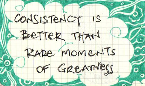
Consistency is key for exercise, parenting and, yes, that’s right, messaging.

Yes, consistency is your BFF when it comes to making your messaging stick. Depending on who you listen to, adults have to hear something three to seven times before we remember it.

If you’re switching up your messaging all the time, how’s someone going to fall in love with your organization? They won’t even remember who you are!

This is why consistency will star as our Word of the Week.

How consistent is your messaging? If you’re not sure, do an inventory and find out. (Sounds boring but is quite fascinating!)

Match the Non-profit Taglines!

Messaging is an important part of differentiating your organization. And your tagline is an important part of your messaging. It lets people know how you’re different-or the same- as other organizations. Often, it clarifies your Why (aka your Belief Proposition).

See if you can match these famous non-profit do-gooders with their taglines. Did they do a good job of using their tagline to stand out from the crowd?


Quizzes by Quibblo.com | SnapApp Quiz Apps
How did you score? What was the most difficult nonprofit to match?

Word of the Week: Differentiation (lessons from the Academy Awards)

Jean Dujardin, Academy Awards, Oscars
Jean Dujardin differentiated himself by looking dapper in a classic tux. Mon dieux! Photo credit softpedia.com.

For a lesson in differentiation, it doesn’t get much better than the Academy Awards.

When deciding how to stand out on the red carpet, Jennifer LopezJean Dujardin, and Michelle Williams all faced the same challenge mission-driven organizations do: they needed to use their resources wisely to stand out from the crowd.

No matter how famous you are, there are only so many elements to work with. For celebrities, they look at their natural assets and decide how to use dress, jewelry, hair, and make-up to play them up. For organizations, you’ve got a compelling way to make the world a better place and you package it up in your logo, messaging, website, and materials. In both cases, you consider what the competition is doing (or will wear) and if they’re zigging, you zag.

Blending in is fine if you’re an Oscar seat filler. If you’re on a  mission to make the world a better place, you’d better make like the stars and differentiate!

When’s the last time you stopped and asked yourself (and your organization): Are we standing out or blending in? 


Do you communicate as effectively as you think?

X

Do you communicate as effectively as you think?

X